東京都 代官山
代官山アドレスに対面するヘアーサロンのインテリア計画。
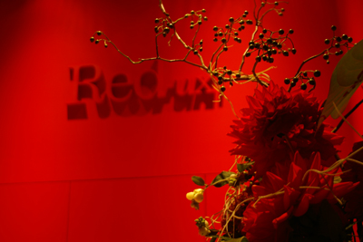
photo by D4m shinjiro kikui
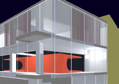
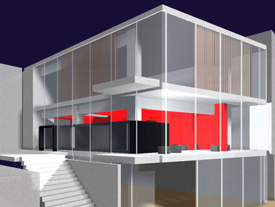
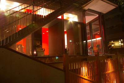
■アドレス側の姿
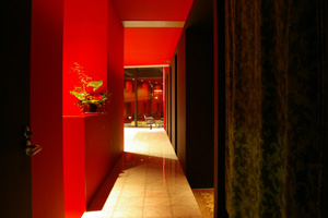
代官山もアドレスができてすっかり成熟した街に変化しました。代官山の駅からアドレスの前の坂を上っていくあたりの景色は、道路がゆるくカーブしながら上っていきとても変化に富んだ街路景観となっています。見上げる形でのファサードは赤い色とコンクリートの質感で落ち着いたインパクトを与えています。
Daikanyama has changed into a town that can do the address and is completely mature, too. Scenery around to going up on the slope in front of from the station in Daikanyama to the address is a street spectacle that goes up as the road loosely curving and is very varied. The facade in the shape at which it looks up gives an impact settled by a red color and concrete feeling of quality.
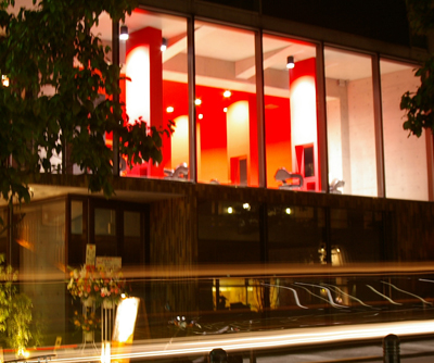
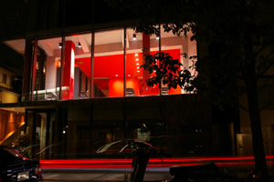
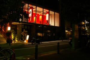
photo from adress side
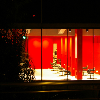
photo at night
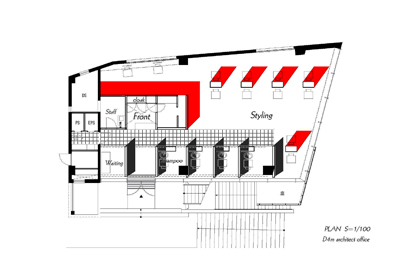
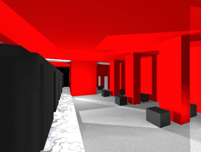
■抽象化された要素
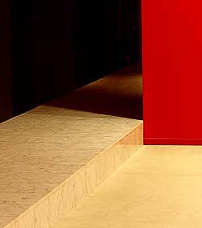
クライアントからはこの景色の中で違和感なくアピールできる存在感あるインテリアを求められました。上品にガラスの箱に入っている赤いボックスというイメージを提案しました。また素材も赤と黒の対比にあわせコンクリートの質感とアプローチ部分の大理石のステージ部分と素材を絞り込んで、抽象化されたイメージにコントロールしました。
material
The interior that was able to appeal from the client in this scenery without the sense of incompatibility with a sense of existence was requested. It proposed the image of red box that existed elegantly in the box of the glass. Moreover, the material also narrowed the stage part and the material of the marble in feeling of quality and the approach part of concrete of putting together to the comparison of red and the black, and it controlled to the abstracted image.
first concept model
final concept model
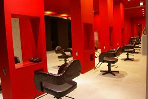
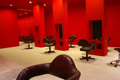
■高揚感を与える赤い色
赤い色は、何段階か見本をつくり外部からの見え方内部からの見え方など昼間と夜間の発色を確認し、仕上ました。きれいな発色にするためにやはり数度の重ねぬ利が必要で、最終的な黒との対比 コンクリートとの対比は抜群の発色になりました。対面のカット面はやや厚みも持たせることで鏡の部分の立体感を感じる要素にまとめられています。天井高を生かした構成と、整理してシンプルに構成された空間がスペースの余裕をより際立たせることができます。
It is ..confirmation.. finish . as for Tairo at daytime like how from the inside of how from the outside of making it to see it as for the sample etc. to see it and nighttimes. whether a red color is how many step floorTo make it to beautiful Tairo, the comparison with the comparison concrete with a profit of several degrees not piled up still necessary, final black became preeminent Tairo. A facing pane has been brought together in the element where the appearance of solidity in the part of the mirror is felt by giving the thickness a little. The composition in which the ceiling amount is made the best use of and the space that arranges and is composed simply can make it stand from room in space at the more case.
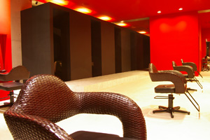
styling space
■空間の密度を変えるライティング
最近のヘアーサロンではカラーリングの普及によりより演色性のよい照明が求められております。一方で照明の意図的なむらをつくることで、空間の密度感が違って感じられます。その相反する要求を満たすためにはある程度の経験と知識が必要になります。今回のケースでは天井面が煩雑にならないように、また適度な照度と色温度が確保できるように照明デザイナーと打ち合わせを行いました。
A good lighting of the color rendering or more is requested by the spread of coloring in a recent hair salon. The density feeling of the space differs and is felt by making intentional irregularity to illuminate from one side by me. To fill the conflicting needs, some experience and knowledge are needed. It made arrangements with the lighting designer in this case for the ceiling side not to become complex and to secure a moderate illuminance and the color temperature.
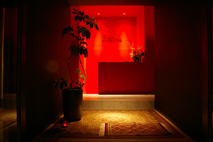
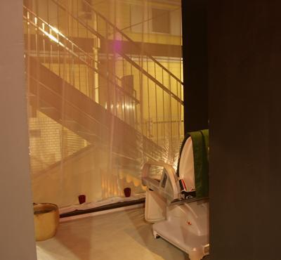
entrance
■リラクゼーションスペースとしてのシャンプーブース
今回の特徴はシャンプーブースを個室のような区切りを設けたことにあります。クライアントからの要望はより高いリラクゼーションにありました。プライバシーが保たれつつ、開放感を感じることのできる美容院にするために、一般的でない外部に面して座るという特徴的なプランにしています。
This feature is in installing the delimitation like ..shampoo booth.. private room. The demand from the client was in higher relaxation. It makes it to a feature plan of facing outside not general to make it to the beauty parlor where the sense of relief can be felt being kept privacy and sitting.
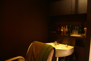
shower box
■Red-ux 東京 代官山
東京都渋谷区代官山町20-5 JPR代官山2階
TEL03-5456-2227
http://1-001daikanyama.beauty-salon.vc/